Story pages
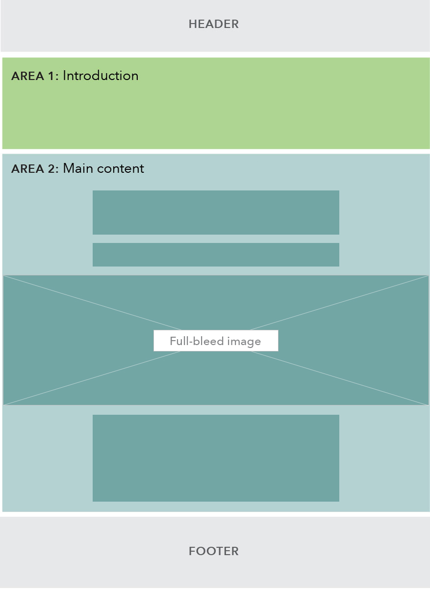
The story page uses full-bleed images and scaled-up headings to create highly visual pages that help to tell a narrative or story. The template should be used sparingly for content that needs a more visceral or emotional impact. Reserve the use of story pages for higher-profile initiatives. An example of a story page is the racial equity page.
Standard story page
| Story page wireframe | Example |
|---|---|
 |
Example: Racial equity |
Specs
On desktop, the H1 in the hero is rendered at display heading size while all H2s are bumped up to H1 size (34px / 2.125 ems) from their standard size (26px / 1.625 em). H3s and below render at standard sizes.
Use cases
When to use
- You want to tell a story or make a statement; and
- You want the story or statement to have emotional impact that will be enhanced with the use of full-bleed images and large headings; and
- The page is intended to be fairly high-profile (e.g. a director’s priority page)
When not to use
- You want to quickly direct readers to specific content on a given topic. Use the sublanding or browse page instead.
- The content is informational and text-heavy, such as an article or blog post. Use the learn page instead.
Guidelines
Content guidelines
The hero area should contain an H1, without any additional introductory subcopy.
- 41 characters max (one-line heading)
- 82 characters max (two-line heading)
H2:
- Headings should form the narrative backbone of the page - when read together, they should tell a story.
Behavior
Full-bleed images will shrink to fit as the viewport is resized.